got to play a technical test version of Arknights: Endfield. my initial reaction after booting up the game for the first time is wow, for a technical test build, this game looks solid already. the game running smoothly on my good old 1660 super (it’s capped on 60fps anyway so yeah). the first cutscene and the “tutorial” section where we move around and have some “reunion” with the Tower of Babel are really cool first impressions. so this post is pretty much wrapping up my experience during the technical test since during this write-up, the game server will be close in around a day but I can’t really play the game anymore due to AFK.
quick disclaimer, I’m not going to talk about story, since it definitely need some work because it feels so weak right now and I believe they will be improved on the release version of the game (cope). also not going to compare it with similar games (like Genshin, for example) since I never played it.
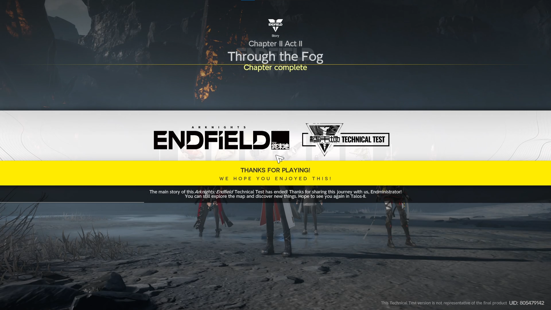
by the way, I really love the Triaggeloi boss fight. unfortunately, there is no way to trigger the boss fight again after completing it.
combat
combat experience is somehow hit or miss, at least for me. first thing first, I really like that everyone on the team appears on the screen at the same time and actually does some damage and even tank damage from enemies. adjust my gameplay and action based on my team position and action gives me more immersion and makes me actually think about how to properly set up the strategy. but the AI for uncontrolled operators definitely needs some works. their navigation and action are sometimes missed, making me need to spend resources to either heal or resurrect characters that I don't control. nevertheless, I really like to bring 4 characters on board and see all of them actually on the battlefield and contribute in some way.
second is attacks. while I really enjoyed the skills and the ultimates of each character, the basic attack did the opposite for me. basic attacks feel so weak and dull, rendering it pretty useless in my opinion. in the end, unless I know that I can kill the enemies with basic attacks, it becomes a running simulator waiting for the skill charge and dealing the skill to the enemies. I think the basic attack needs to be improved in some way, maybe the damage or maybe overhaul the mechanism completely to make the basic attack more reliable so that we don’t just activate skills and then run away. speaking of skills and ultimate, to be fair I really enjoyed using them. it is so satisfying to basically think of the skill activation sequence to deal damage and effect to the enemies as optimized as possible. my only problem with skill is when doing a quick switch after a skill cast it may result in loss of the previous skill effect, which to me doesn’t make any sense. skill casting is also pretty good overall (except Fjall, dude your skill cast area is so short haha). Dealing effects to the enemies is also pretty satisfying. Pretty much the same with Arknights, you can inflict effects like knock-back, lifting, knockdown, etc., and talking about dodge, to be fair I don't really care about it. while most people says dodge is a must, I see it it only something that nice to have, sure it will make the game control so much easier, but it with current control I find it perfectly fine. maybe dodging for uncontrolled characters is a good thing I guess.
third is orb mechanism. let’s be honest, I don't really care about this. orbs spawn are random and only some skills can deal fusions and chaining making me not really rely on these mechanics. in the end I just spam my skills and let the orbs fusions whenever happened.
last is control. boi as a 60% keyboard user, switching between characters is pain in the ass. since you can’t bind it to other keys meaning I need to either press Fn key everytime I want to change character, only change characters when their skill is active, or using mouse button and remap it to F1 to F4 keys. In the end, it is so frustrating to not have the option to rebind those keymaps.
small QOL feedback, having more item slots (increase it to 4-5) would be a great addition too. currently I think 3 is fine since you probably need to bring 1 healing item 1 buff item and 1 ressurection item, but having more healing item or buff item slot is really appreciated.
enemies
I kinda like the enemy design in this game, but I would like to see different kinds of monsters and mini-bosses across the maps and make it feel like there is always something new to be discovered. boss fights are definitely fun to play. crisis stages are also challenging and fun to play. really wish boss fights were replayable (maybe include it on rifts or something that would be cool).
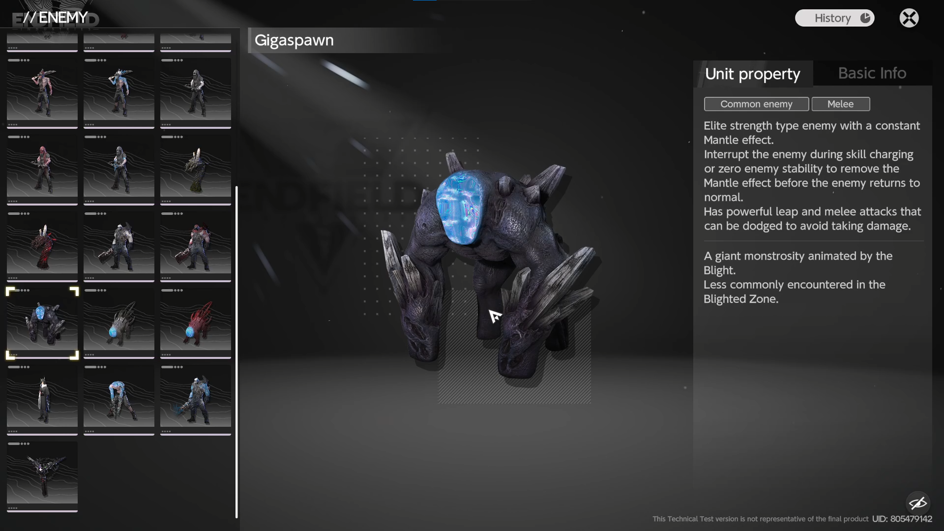
but sadly while the enemy’s level is scaling up alongside your progress in certain maps, it doesn't scale up on the previous map, making enemies easy to deal with (just one hit and boom, gone). I wish they also scaled up based on our operator's level or other indicators (I imagine it like mobs on Nier:Automata).
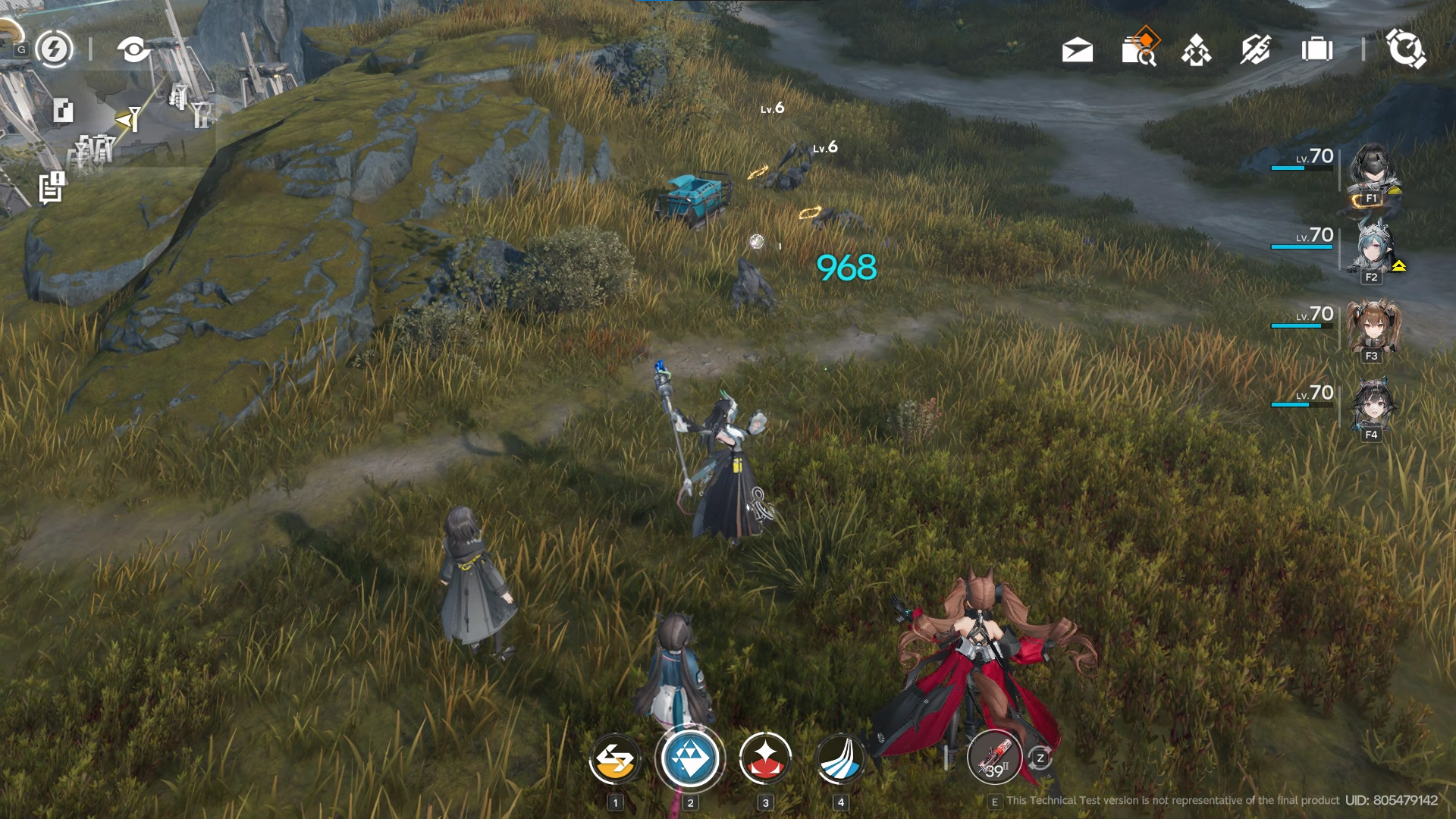
like in the hub base for example, killing lvl 6 aggeloi using max level operator is just one mouse click away. I really wish enemies here also scaled up based on our progress.
I also like the buffed enemies concept on Crisis rifts. something that I really looking forward to see again!
characters and animations
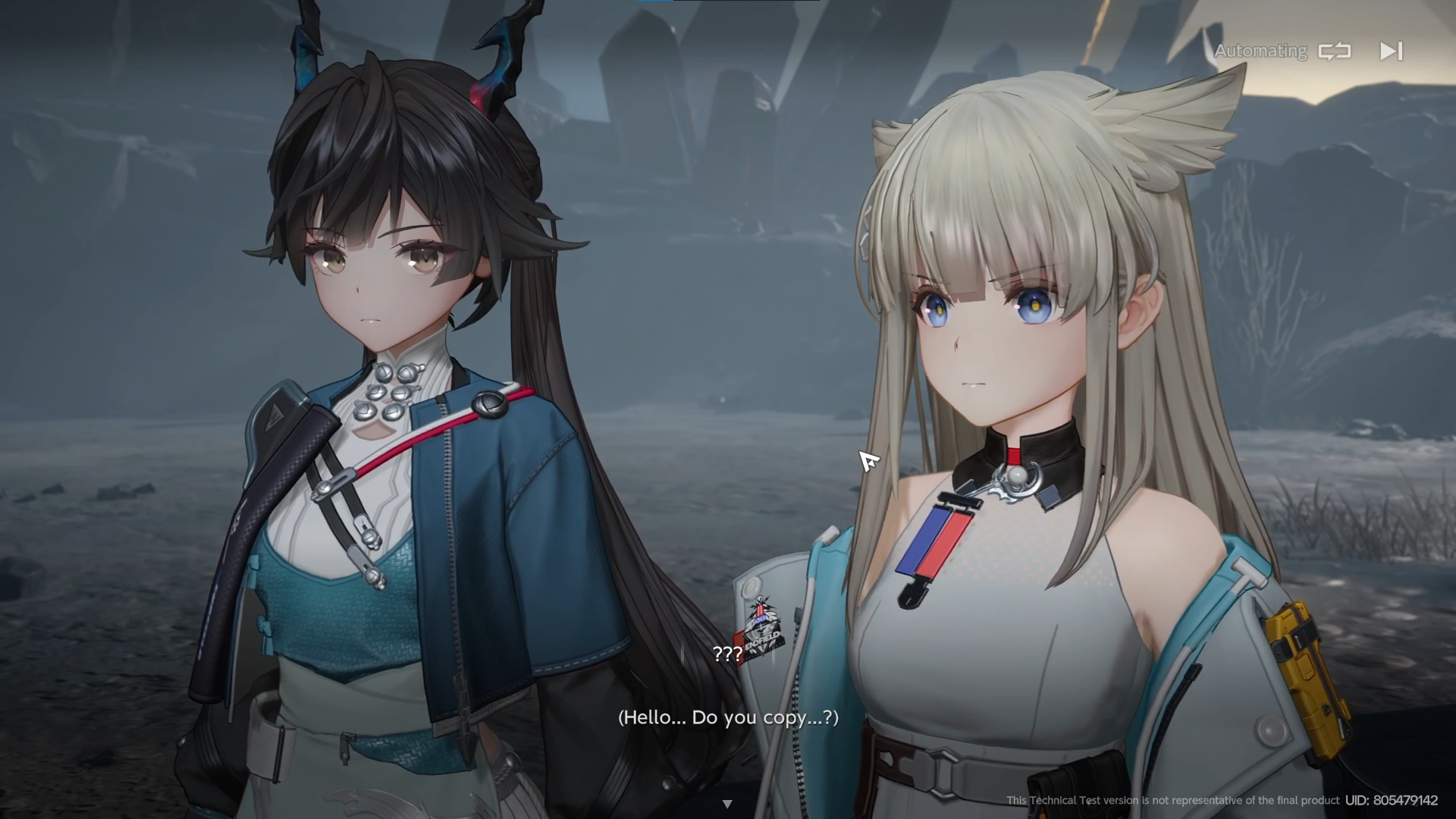
I have no problem with the characters and animations. they are all just perfect. maybe because coming from Arknights where everything renders in 2D, it gives me a nice look at how the characters will appear in 3D space. the animations are also awesome. I can spend minutes just swapping between characters and menus on the character page. it's just buttery smooth. each characters have an animation on each menu and each position on the team is so good. love the attention to detail there. cutscenes are also worth to watch. my favorite is of course pre-Triagelloi boss fight and post-Triaggeloi boss fight. I’m not going to talk much about voice action and grammar here since I don’t really care about that for now. but something that I want to point out is character’s facial emotions during story narration are a bit lifeless so to speak. hoping something to be improved here.
weapon system
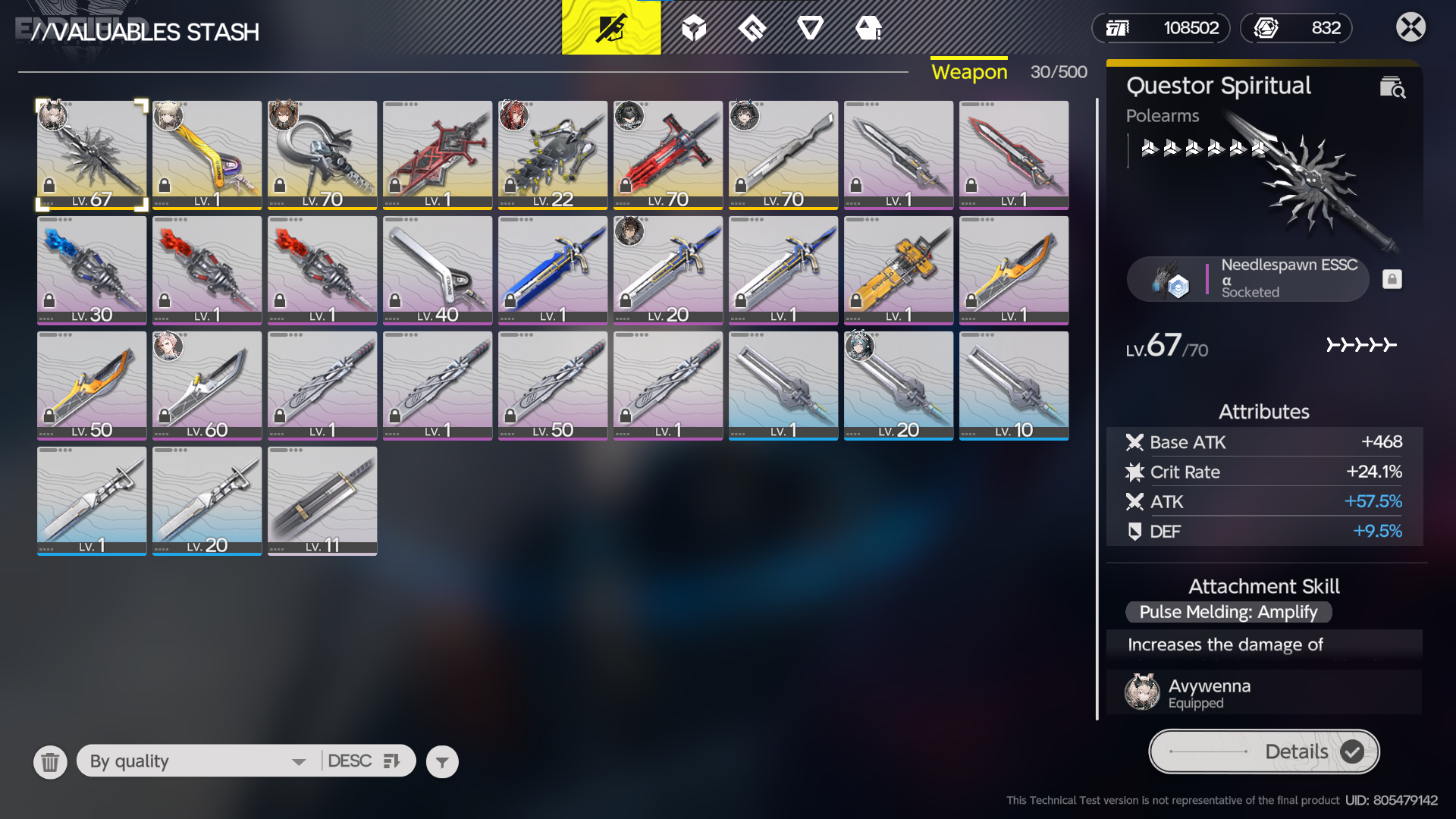
weapon’s essence system in particular is a bit weird. at this moment it feels so clunky and random in some ways. you have so much dropped essence that in the end looking into them one by one to find the perfect one for the weapon is so time-consuming. the upgrade mechanism is just grind gameplay which becomes boring when you do it many times. at least they give some resource refunds if it goes over the max cap when leveling your weapon.
in the end, I don’t pay much attention to this. I just pick the good weapon for the operators, upgrade and tune it until capped to max level, and put a random essence that looks good to me. I hope this system can be enhanced in the future since I still believe this system has potential.
oh also, I really hope I don’t need to gacha to get the weapon when released but I guess that never be the case 😅.
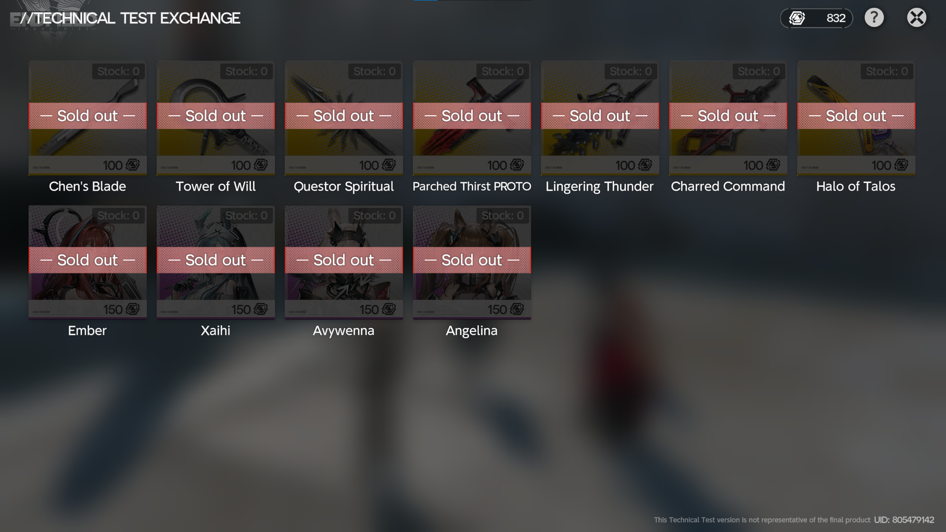
the weapons itself looks good already in my opinion. the design looks cool, even though the names are kinda weird and the detail is too generic at this moment.
rifts
I don't know how to describe it, but rifts somehow feel out of place. it just feels like a repetitive dungeon that drops items for upgrading and leveling, and that’s it. no particular connection to the lore or story, no particular connection to the world itself, just a pure random dungeon-like map for you to grind. I hope it has some rework or at least give it some reason why it exists on Talos in the first place. some people might suggest auto run on rifts but to be fair I don’t think it makes rifts fun.
nevertheless, I still like Crisis and Unstable rifts. Unstable’s puzzle is really fun to do and also a good way to introduce the game mechanics deeper, while Criris pushes you to do the combat but harder, harder than the boss fight. I really love it since it kind of reminds me of Arknights’s Contingency Contract game mode. really love to push myself to do something more difficult.
missions
main missions are good enough I guess since it tied to the story. side missions are fine, but sometimes it is hard to know what NPC gives you a mission. you basically need to talk to them one by one and hope they give you a mission (this is where I got the mission that unlocks farms, by randomly talking to them). there should be an indicator or at least a hook that lets the player do it because they want to start the mission, not because you randomly meet an NPC and interact with them.
daily missions are too repetitive and so boring. hell most of it you need to walk to meet the NPC, listen to them, and then they ask you to walk again hundreds of meters just to fight mobs that can be killed in seconds. it's just not worth the effort. or you need to find 3 items scattered across the map which so boring. really wish the daily missions were scaled up based on our progress and/or our operator level.
user interface
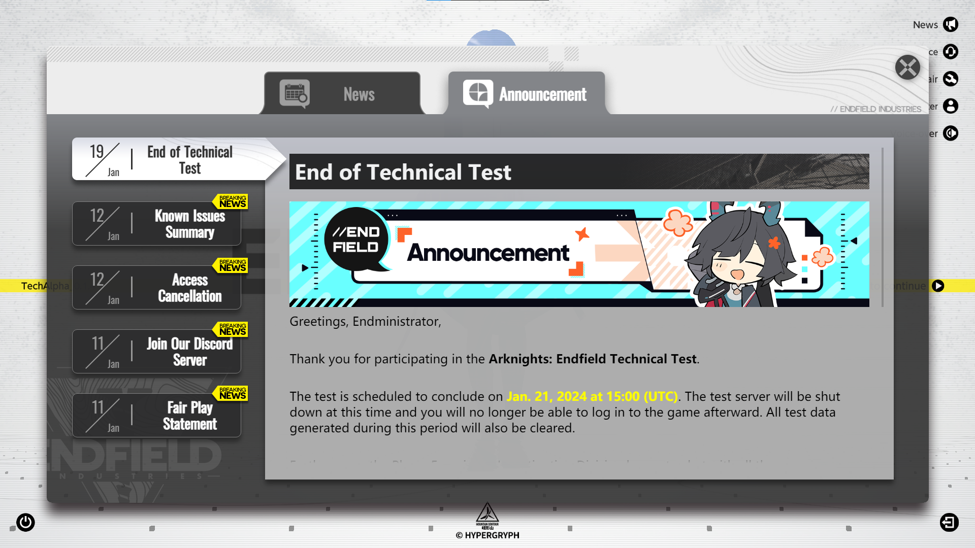
oh boy, I really love the user interface. it looks so futuristic yet still looks like Arknights’s user interface. let’s be honest, I kinda feel at home looking at the icons and the menus, it just looks coming from Arknights. take a look at this announcement and news screen. it just looks straight like Arknights’s announcement screen.
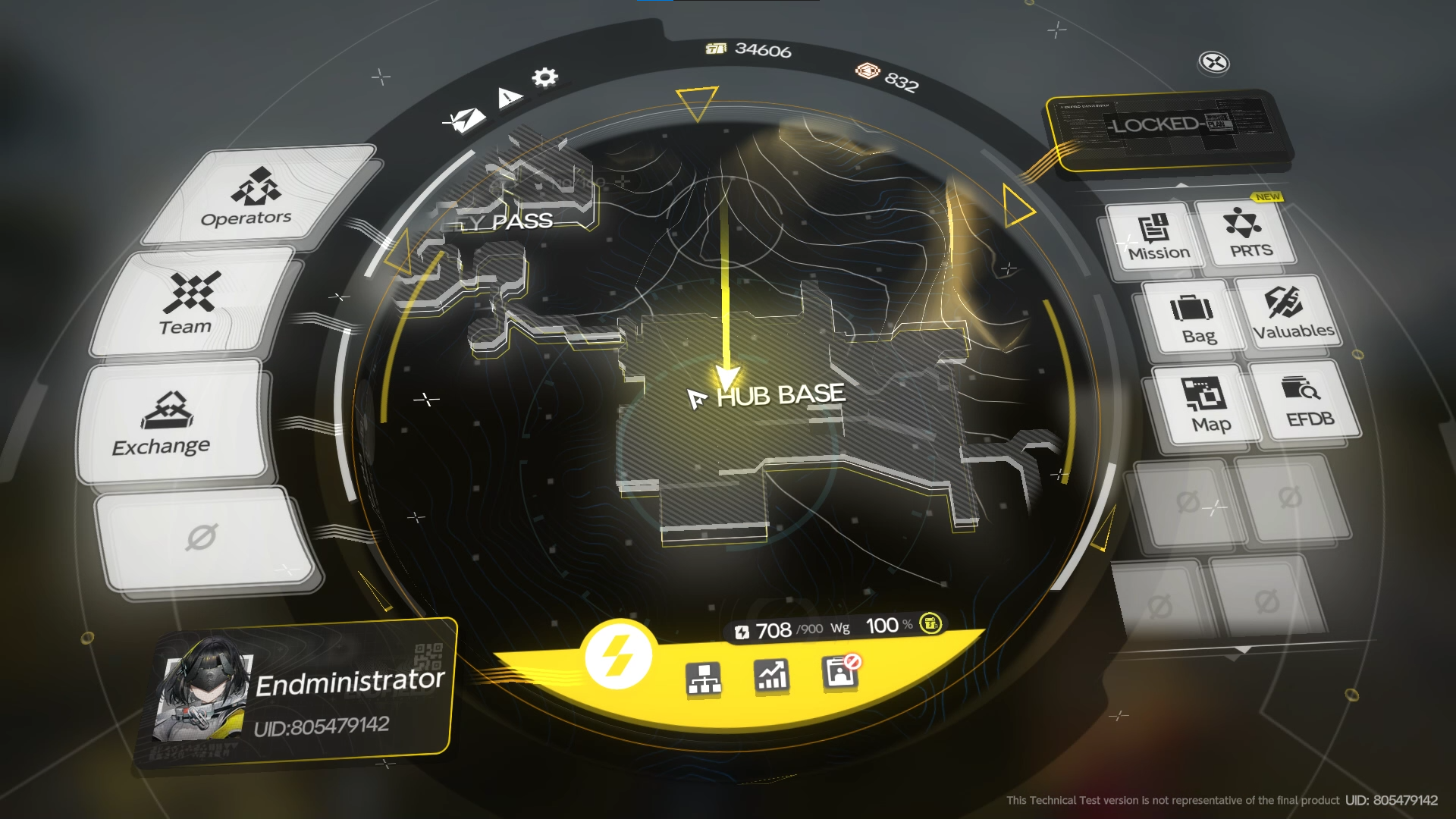
the dial screen for the pause menu is just something else. I like it. the profile section probably looks a bit off but overall it is so good. I personally not really a big fans of the gyroscope effect here but to be fair it’s actually a nice addition to the screen to make it less static and boring.
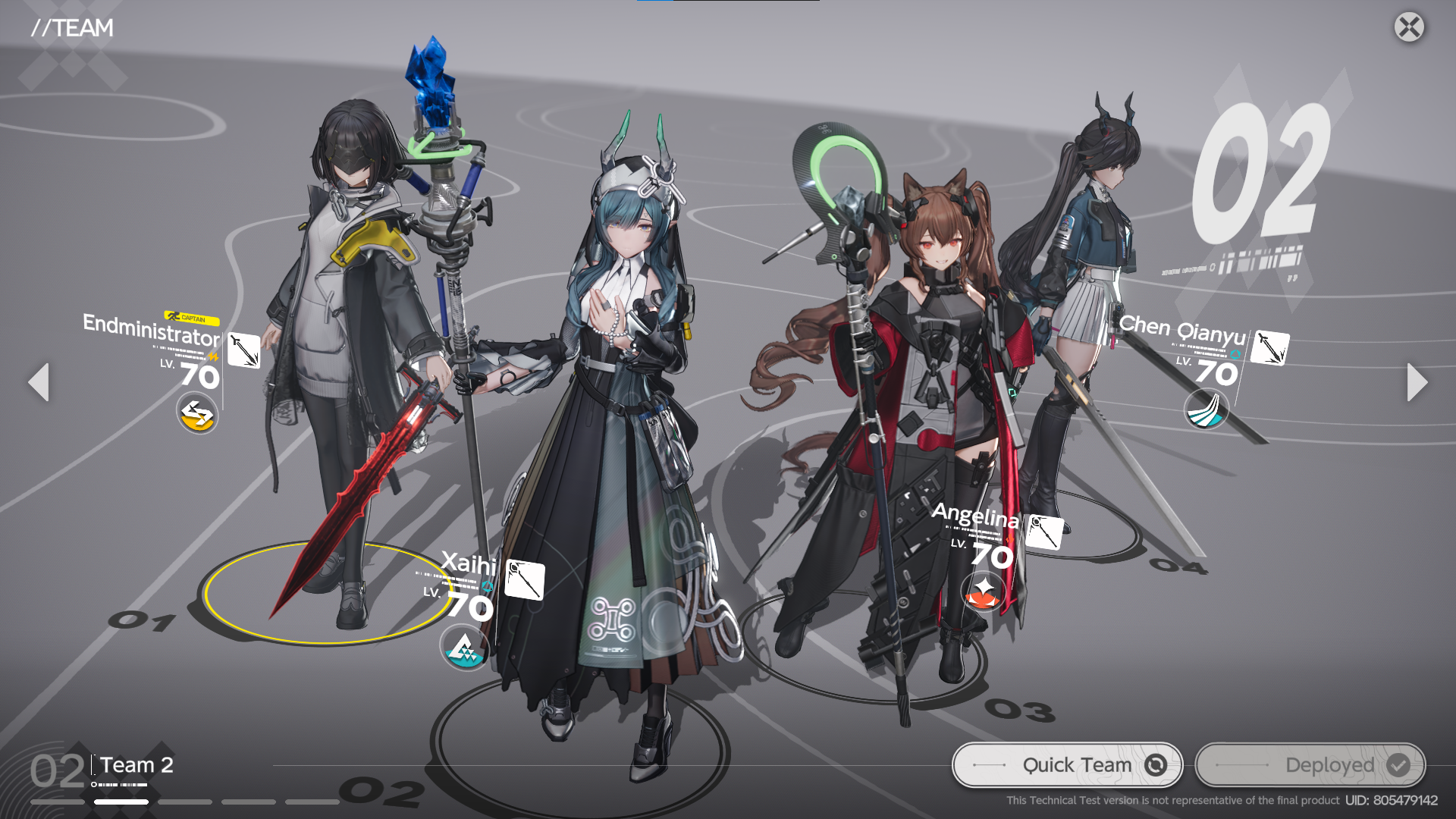
my personal favorite may go into the operator and team screen. I saw the leaks a couple of months ago, and comparing it now, it has improved a lot. it’s not lifeless anymore and it looks pretty cool. although I still don't understand why the second operator has more "spotlight" compared to the first operator on the team screen. overall, they did a great job designing the UI that looks simple yet looks modern on this game. love it!
world exploration and map
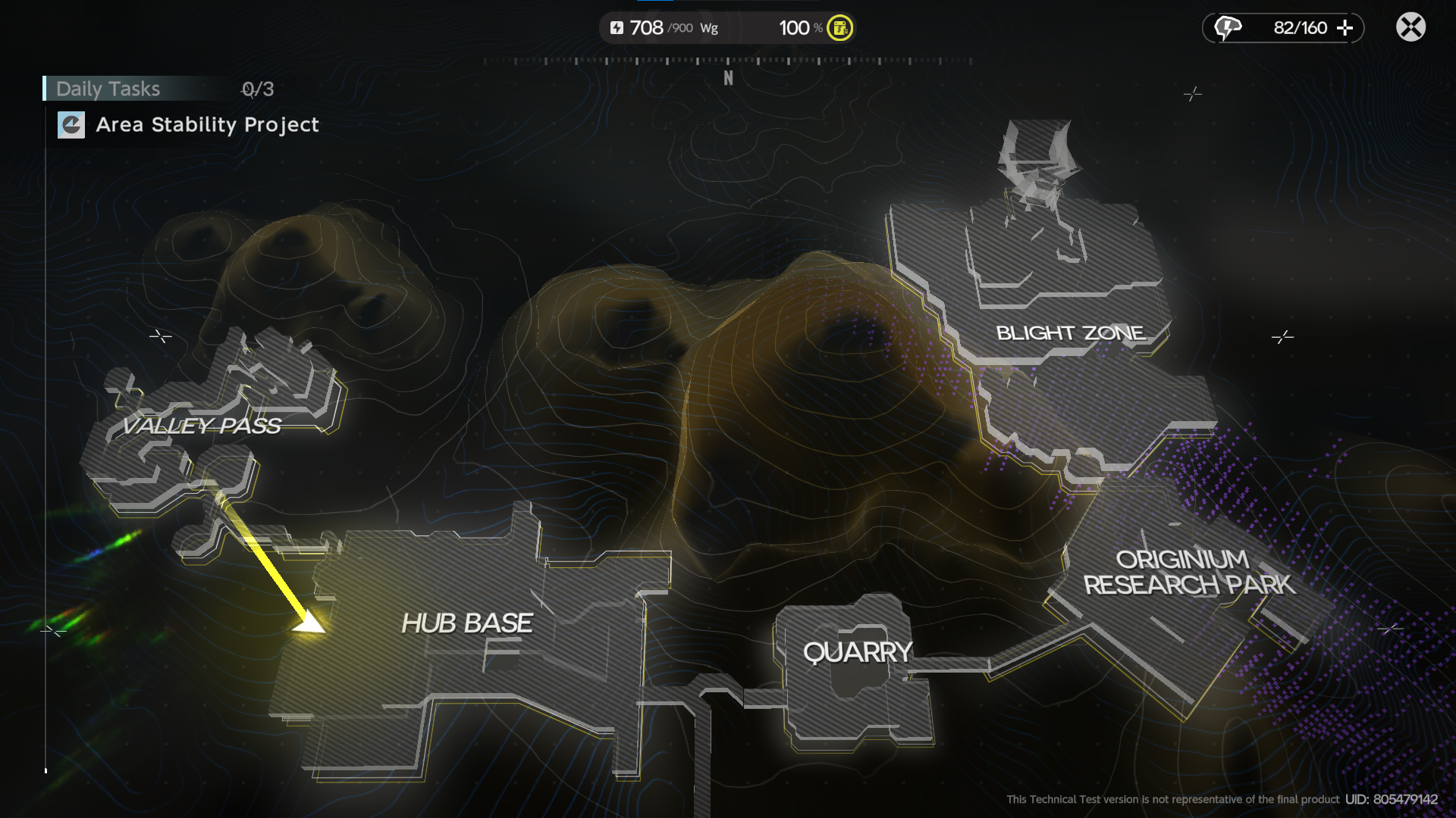
I have a good amount of time exploring the map and looking around for something cool or maybe collectible (even though I didn’t collect all of those collectibles). so I will give some impression of me exploring the maps. overall map tone is a bit dull, I mean sure it does look perfect for the game and the story but still, it lacks diversity overall. some maps also have weird or unintuitive world borders, making exploring feel restricted. and my overall problem is each map feels disjointed, it doesn’t feel have any connection between each map. I mean it is unique and easy to tell the difference but it is too distinct making it a bit disjointed.
hub base
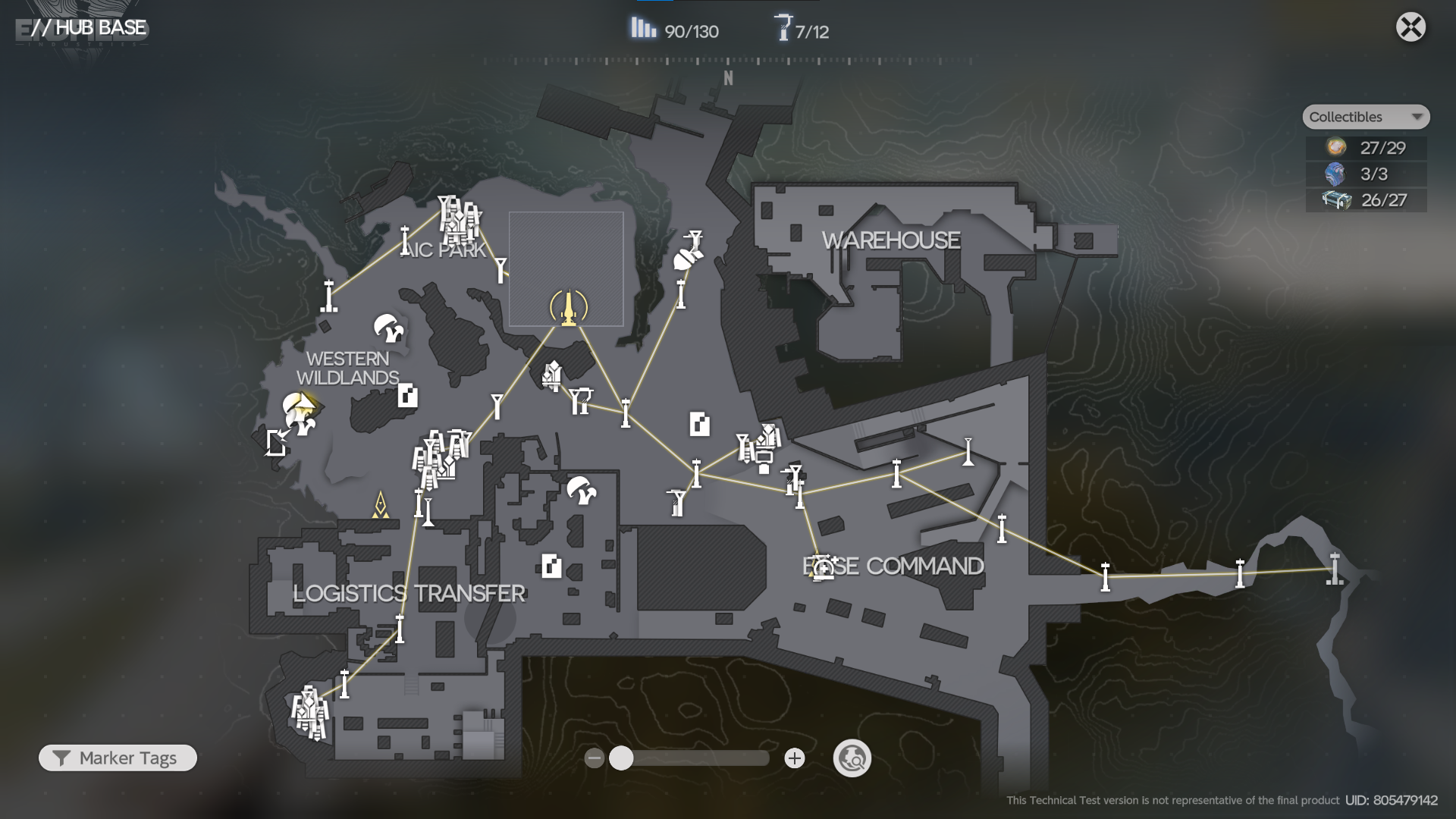
the hub base is really fun to explore, although it feels so big but so empty for now. this is where most of your time will spent anyway so making sure it’s big enough to explore is good, I guess. the concept of combining modern tech buildings and wilderness into a single explorable map is a huge point to me, giving you more engagement to explore every single spot on the map. it doesn't really have complexity and vertically making it easy to explore and navigate.
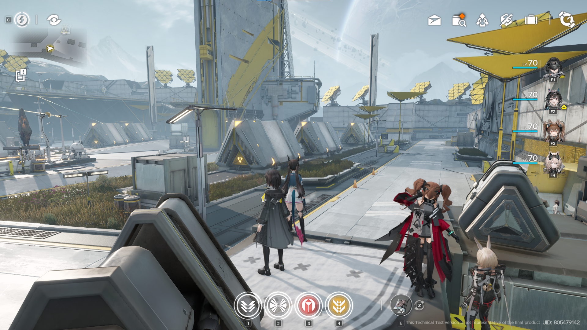
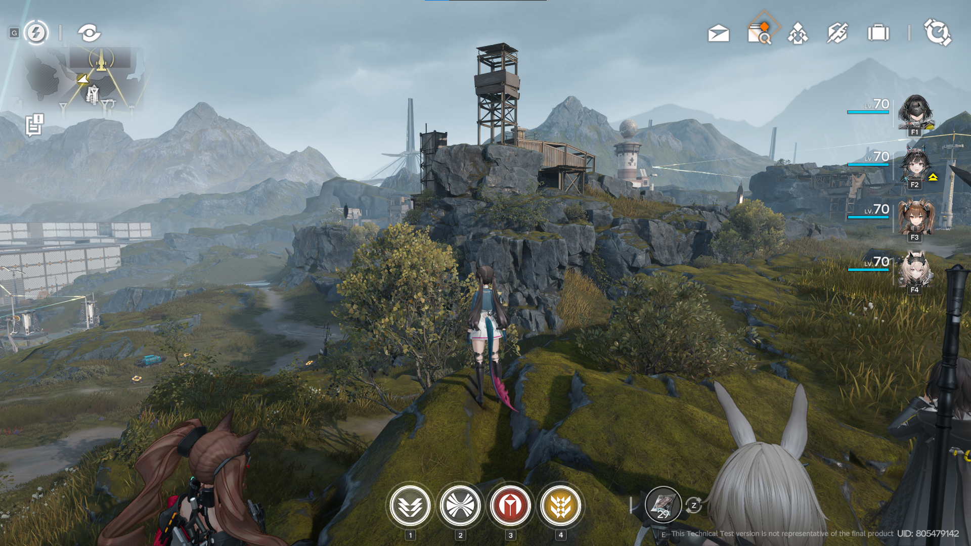
oh also, the lone trail easter egg is cool (maybe I'm biased because I love Blues with You), but still nice addition.
valley pass
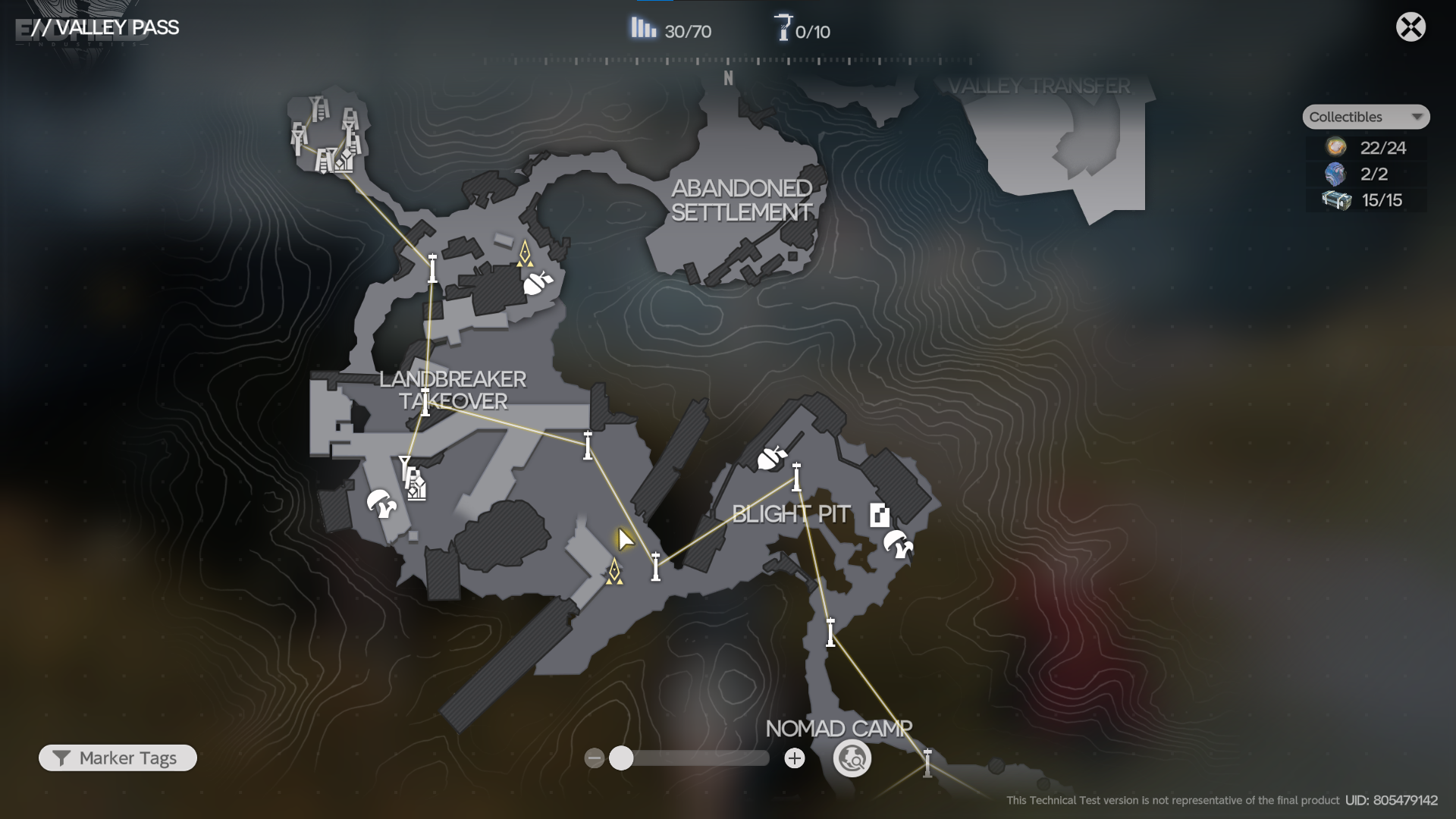
this map’s tone is pretty good. broken buildings and infrastructure combined with wilderness and originium shards is really cool. sadly I didn't explore this map that much since there is nothing to do here. I hope they have more content in this map except for the boss fight and a very tedious daily mission here.
quarry
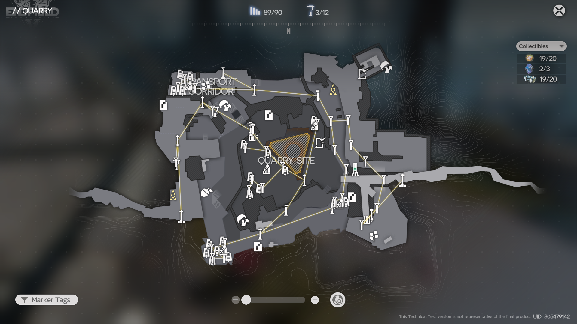
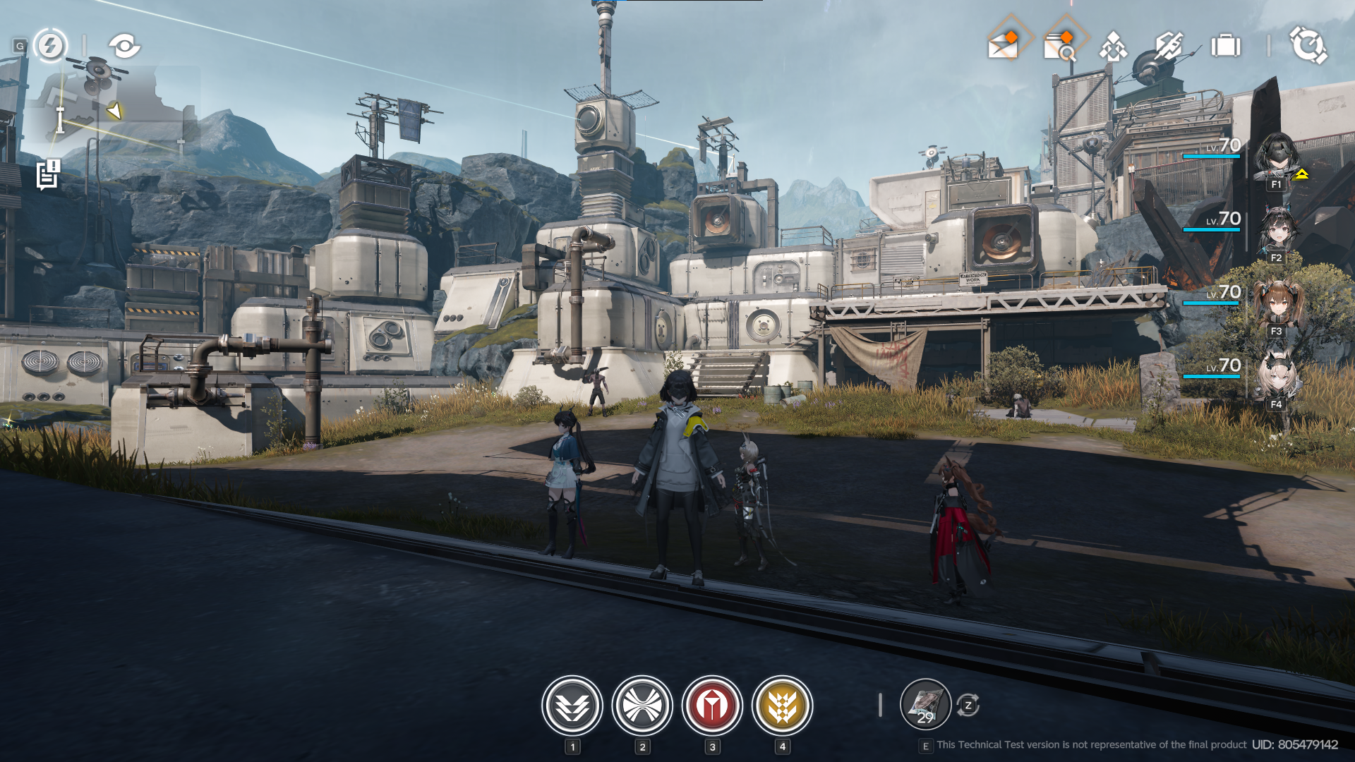
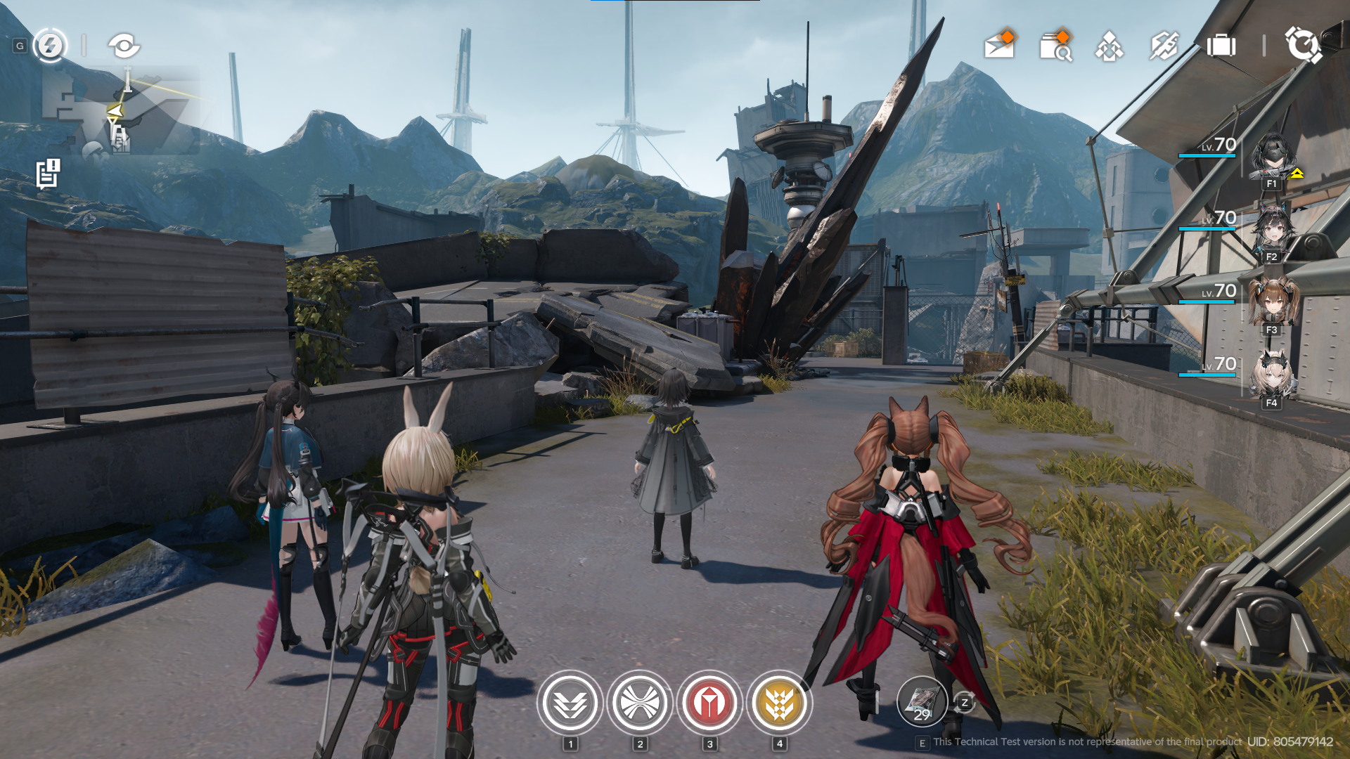
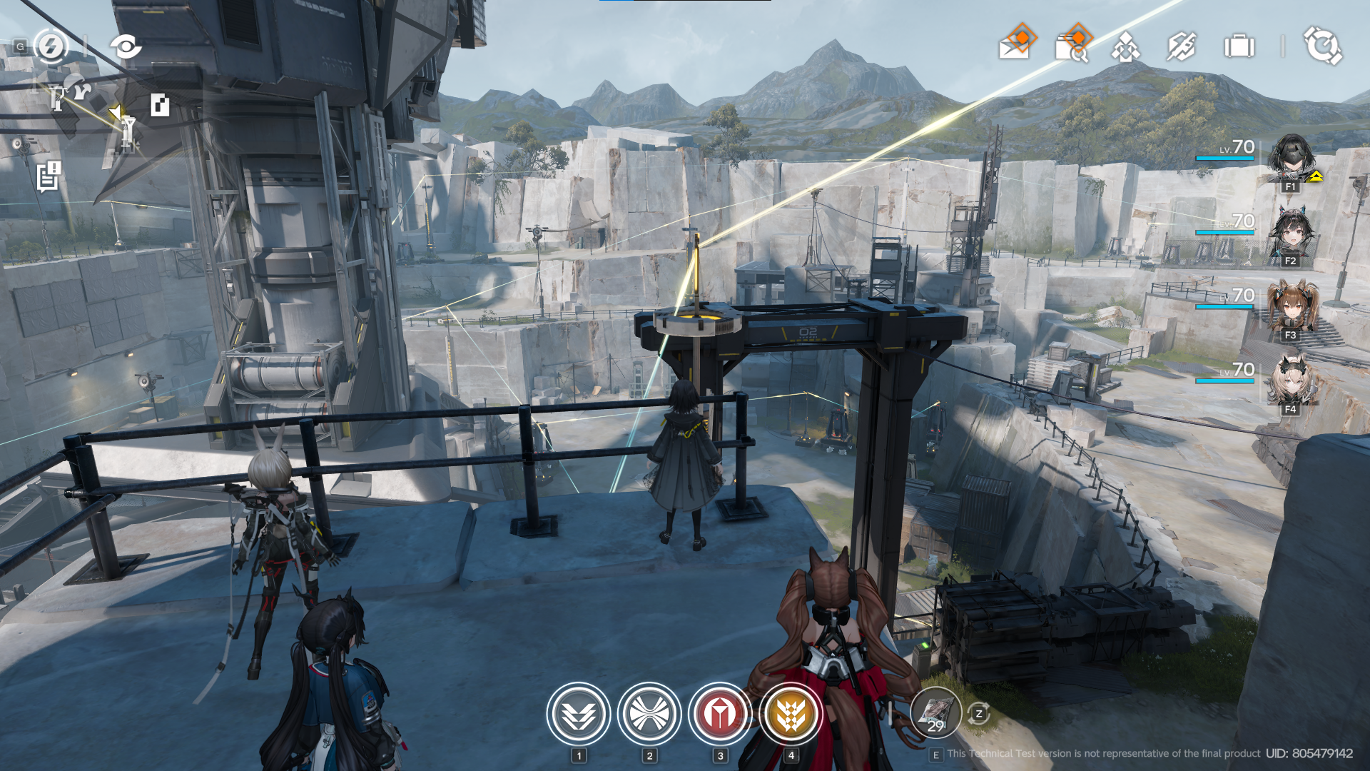
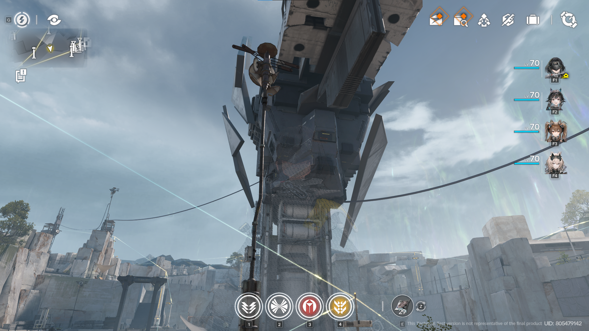
this is where the problem of exploring maps vertically starts to show up. the overall map design is a bit bland, just a big structure surrounded by some stone-mining (?) site. this map introduces the vertically explorable map. the issue is that the marker does not give you an indicator of what “level” your destination is except for some yellow glow on the marker. wiring electricity here is really a pain in the ass. I had some experiences where I fell off the cliff and made me redo the wiring again multiple times. and the fact that almost every single corner of the map looks similar makes me a bit disoriented sometimes. but yeah, overall I feel this map is a bit boring and probably can be improved in the future (explorable quarry site, maybe?).
originium research park
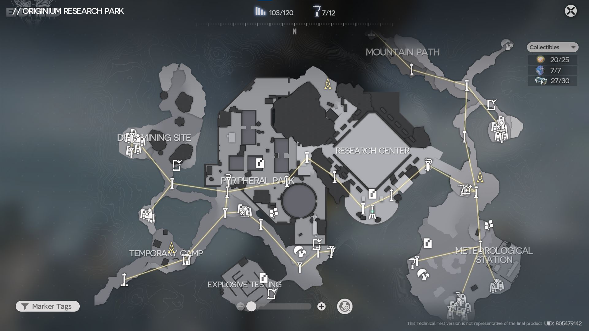
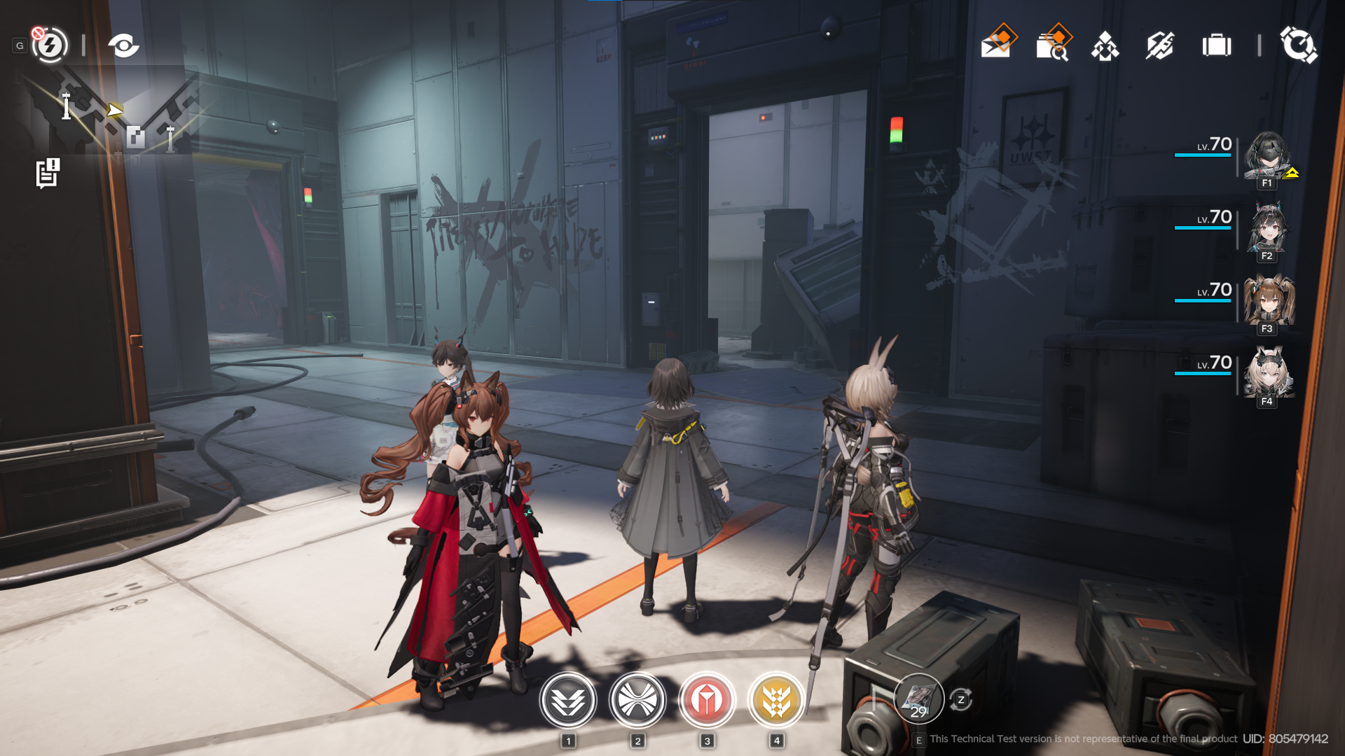
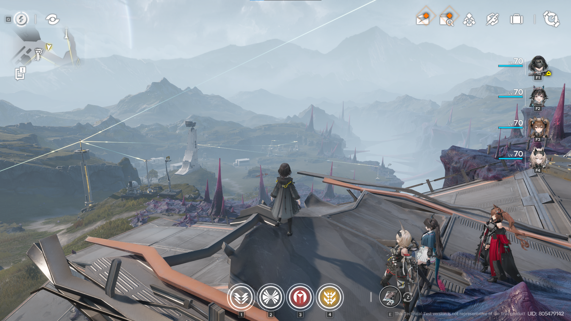
this map is so complex that I really had a hard time exploring. but overall, I sort of like this map. broken laboratory with huge originium shards everywhere combined with blights make the map look diverse. this map doesn't have verticality making it easier to navigate. this map is really fun to explore, especially with ziplines to cross the huge gap, giving you some cool experience with cool scenery to enjoy. the indoor map structure is pretty complex yet somehow still easy to navigate. indoor (and on explosive site) props somehow feel so different compared to the hub base. while the hub base gives you a modern vibe, this one gives you an old, more retro vibe around it). it also has some description about the name on it (lore-related stuff that can be explored in the future I guess). the farm here is also useful to help me stack rare materials (I wish they made it more obvious instead of giving some side quest that people can easily skip or didn't notice).
blight zone
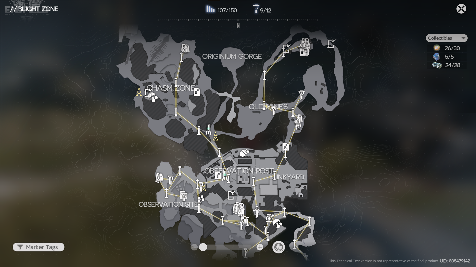
this map is my least favorite map so far. complex map with verticality everywhere, large map with narrow connections between the zones, and stupid mobs that are hard to clear (during the initial run, it became easy when you had progressed enough though). navigating here is pure pain, you fell off the platform and good luck walking back to your position. oh, also don't make me talk about how painful navigating between small bridges made from blight, ugh.
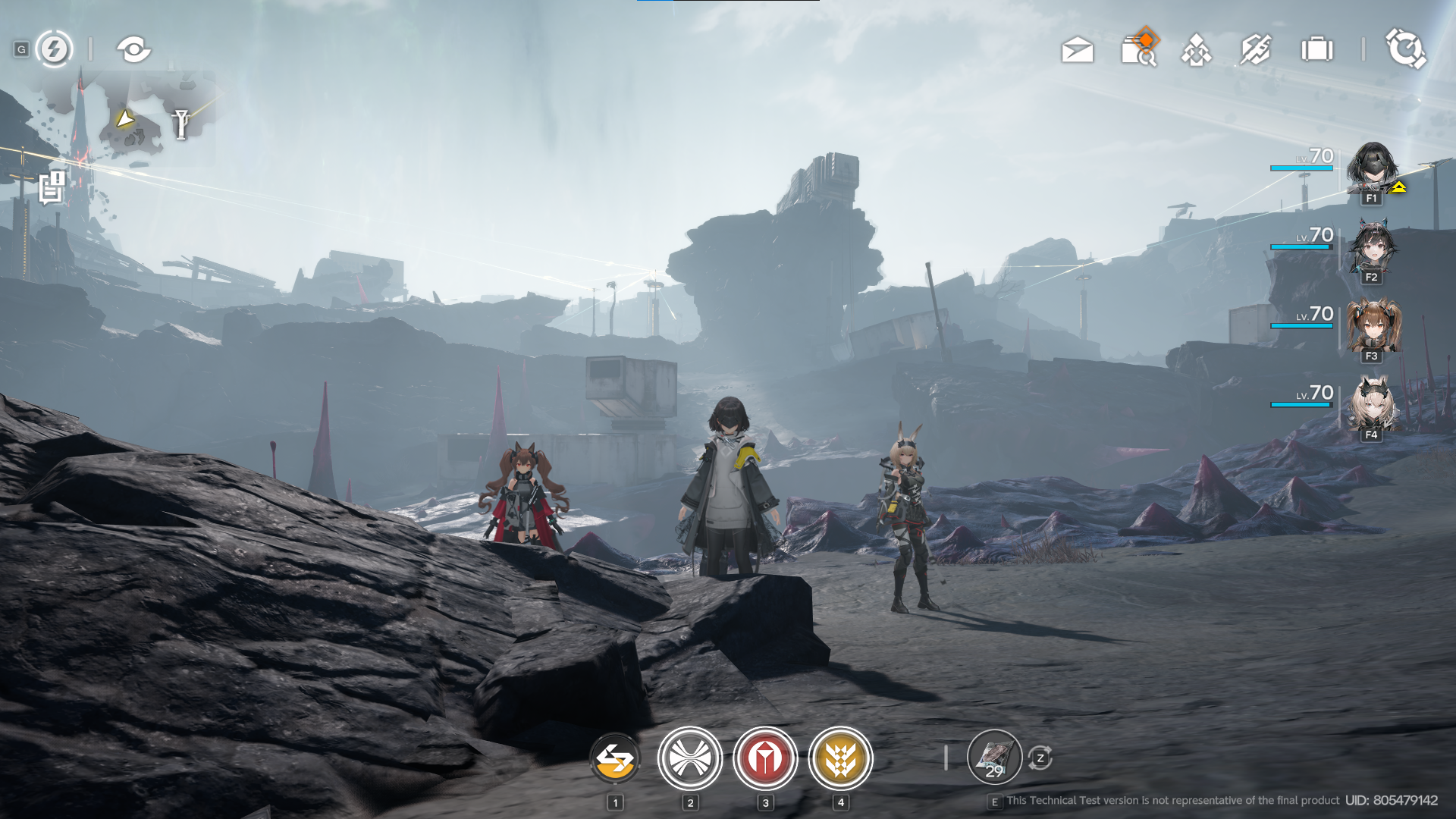
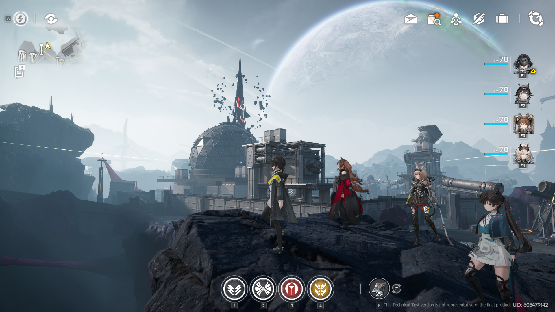
the map's overall design is of course blight-heavy just like its name. pink stones everywhere with some blight-covered huge fossils, abandoned posts, and vehicles everywhere really give you a catastrophe vibe. but sadly, unlike previous maps, I find it really boring to explore because it really felt monotone. exploring the edge of the map also feels unsatisfying, the reward is just not worth it after walking for ages. really wish this map got slightly enhanced to make it less boring and actually give you a sense that blight is a serious thing. but yeah, in terms of scenery, I think this map has the best scenery compared to any other map.
AIC
a bit of disclaimer here, I don't really spend my time building my base because, well, I'm a bit perfectionist, and if I went into this black hole I might end up not playing the game and just stuck arranging my base. but I still spend a good portion of my time working on my base, especially unlocking the tech tree and items needed to progress.
I love the overall design and theme of the buildings. It gives you modern tech vibes and it applies perfectly to all of the buildings. modern tech-thingy buildings surrounded by wilderness also give you vibes that you actually building a base in the middle of nowhere. UIs to interact with the building are also good, again, giving you modern tech vibes.
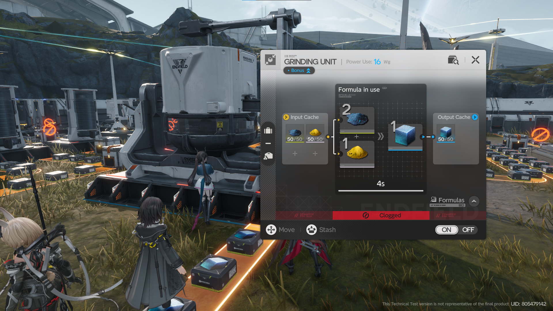
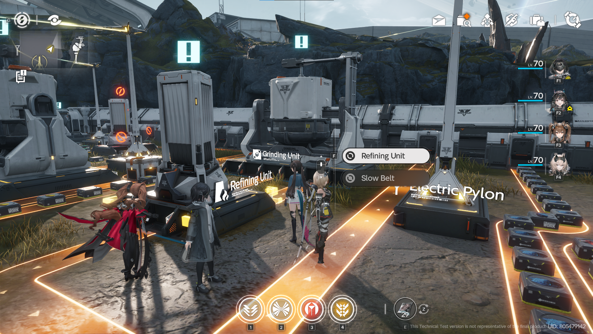
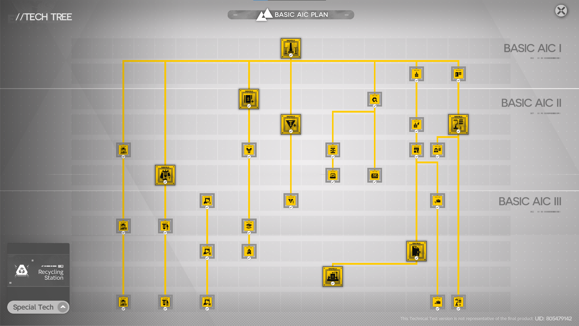
tech tree and base expansion are good additions to help players engage with the base building. when you feel you have a good and optimized base, then you unlock new buildings or your base is getting larger, giving you new toys to play with. tech tree also kept some game mechanics like breaking walls locked until late game, which to me even though it feels too late, is still a good “soft lock” mechanism regardless. also since this is called “basic AIC plan”, I assume there will be more advanced AIC buildings and items in the future.
moving stuff is a bit rough though. the problems are first, every time you move the electric pylon, your electricity is disconnected. while it’s pretty realistic, it is still a bit annoying to rewire everything every time you move stuff or maybe you do some base rebuilding after unlocking the new stuff. second is the fact that your characters are also moving along when you move your building, it sometimes makes it harder to do it. for example, you want to move your building by one grid behind, but your character can’t move there because they blocked by the building that you want to move, resulting in you having to move it way further first and then bringing it back to your original target area. it is a suck experience and hoping it will be fixed or enhanced in the future.
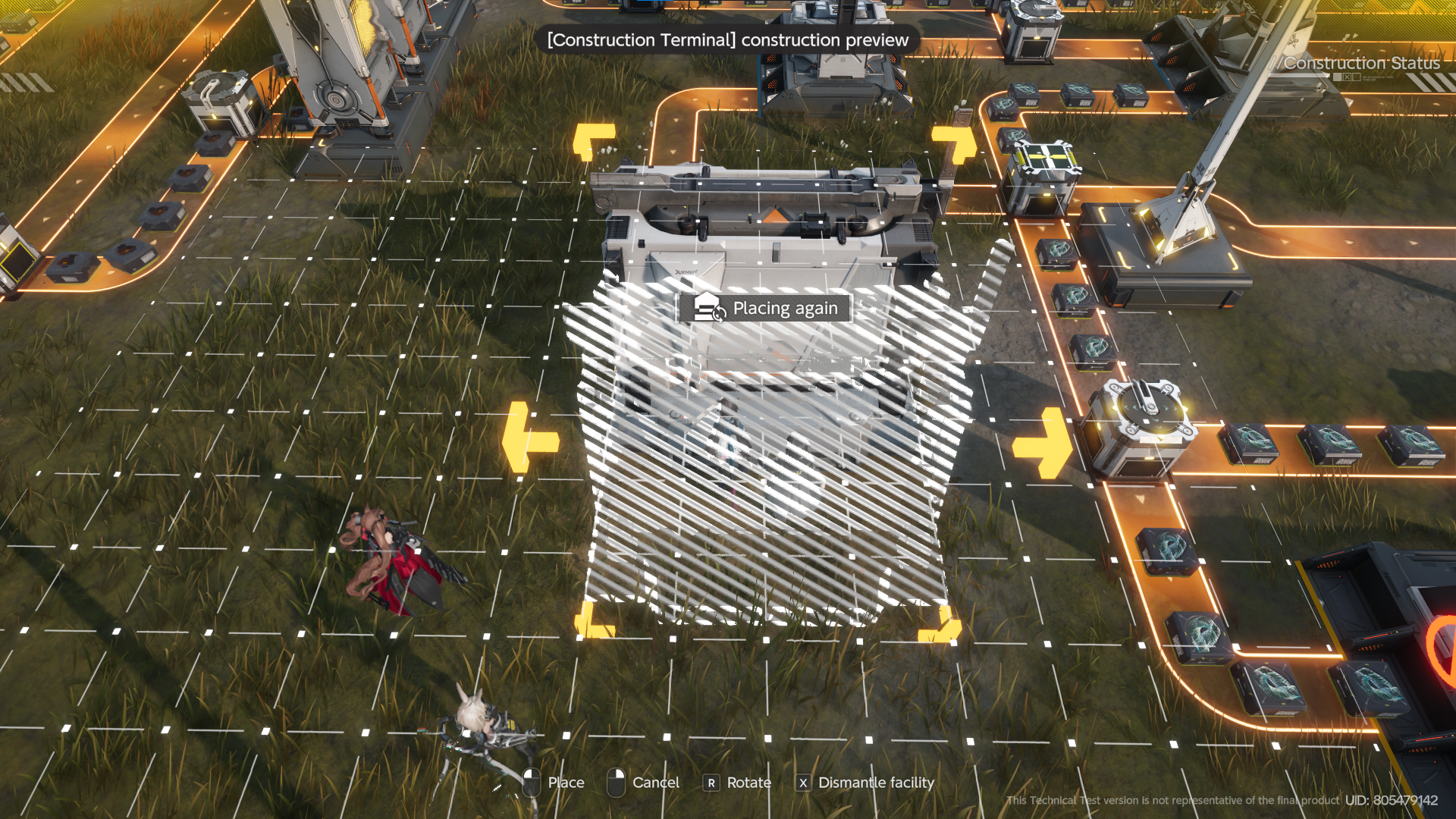
the third one is placing the belt sometimes missed and makes you reroute a bunch of belts that are affected. maybe it is because of me not careful enough when placing it or something but it was still a weird experience regardless.
the last one is when you build or move something around the border of your map and then your character moves out of the border, your progress will be canceled immediately. it shouldn’t let you out of the base in the first place when you do some action related to the base or the building.
now after done the boss fight and stuff, I stuck in base for a while doing some base arranging. but it lacks anything else except for the building and arranging stuff. I think that would be great if there’s some PvE mechanism that lets enemies attack your base so you can also have something else that engages the player except building things (something like Fallout 76 or even something like Reclamation Algorithm).
but anyway, overall I really like the AIC and base-building gameplay. again since the technical test only ran for a short amount of time and I don't want to waste my time here (and potentially get reset after tech test is done), really didn't put so much effort here. but anyway here’s some of the image of my very clogged base (efficiency 💯).
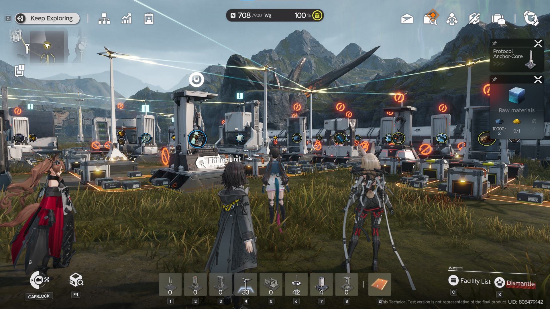
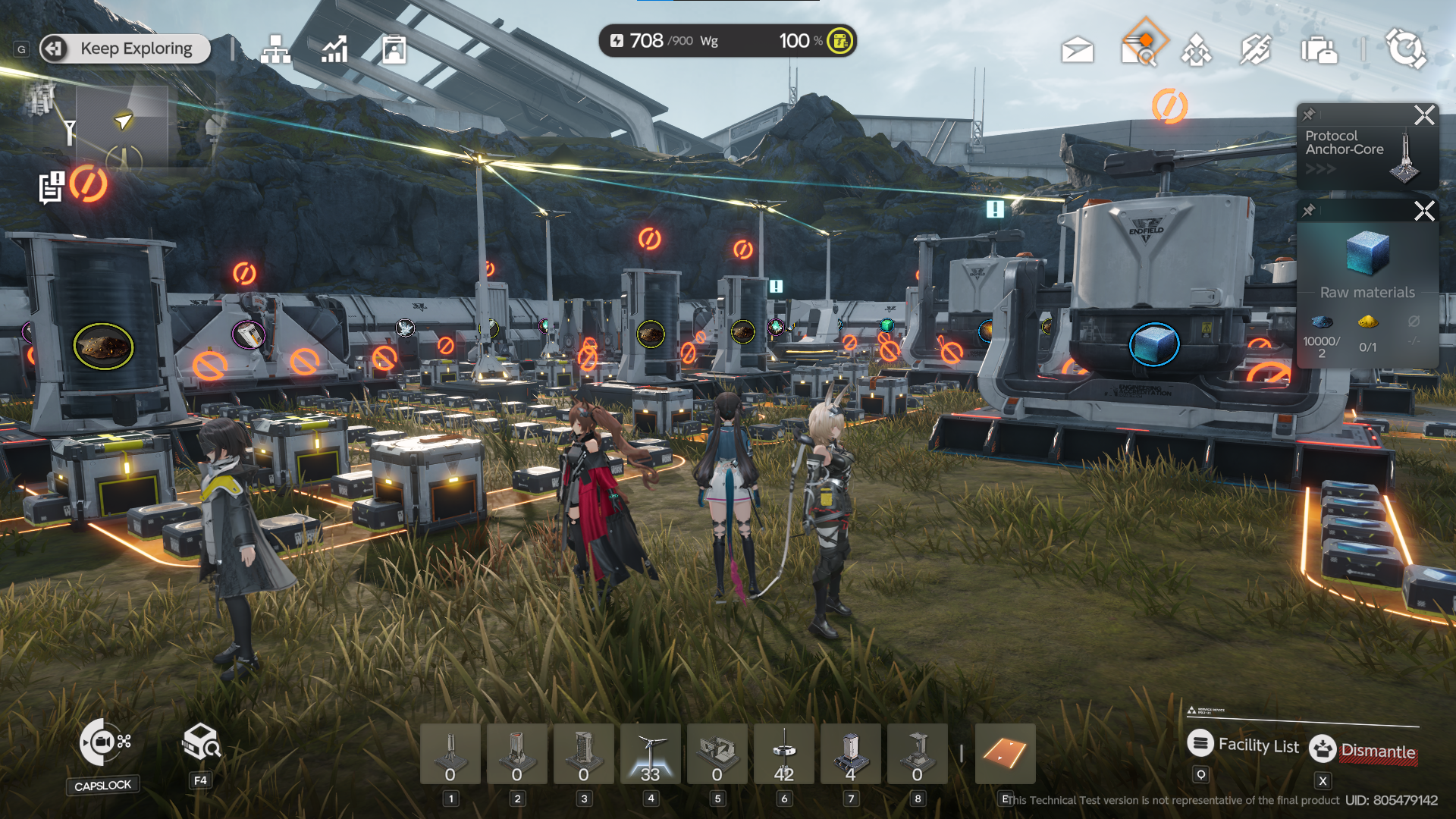
i really wish there are cinematic camera option here where you can take picture of the scenery, or backgrounds without showing the UIs for aesthetics purpose.
closing
this game definitely has potential. even for a technical test build, this game has a lot to offer already, from the combats to the AIC/base-building gameplay. the UI looks polished already and easy to understand. the combats definitely need some work but so far it doing great already. the story is a bit rough and boring, hope this will improve in the future.
AIC/base building offers some game loops that can engage players for hours, but it is probably not for everyone. so the fact that you can beat the game without really caring about this gameplay is something that I also want to see in the future.
to be fair it's still boring overall and not exciting. it has a small amount of contents and things to do except base building. and if you have already done the main story all you can do is just do some boring side missions or daily missions. exploring maps for collectibles is not a good thing for me. grinding rifts for materials is also boring as hell since it is so repetitive and when you have a pretty stacked team you can clear it without thinking. this game needs more content that can engage players without needing to grind rifts or aimlessly explore the map.
I don’t know if this game is suitable for mobile. sure, PC and console seem plausible but for mobile, judging by the gameplay itself I think it's not suitable at this stage (like how do you even control your team when fighting Triaggeloi using a mobile phone?). I'm unsure of the direction for the mobile release but I hope the mobile version has the same content as the PC/console version.
but in the end, I enjoyed playing the technical test and looking forward to the release version of the game!
extras
i will put bunch of screenshot and video here. you know, to compare it with the release version and see the changes.