You’re tasked with creating a dialog and a checkbox with label below it. At first glance, it seems simple, right? If we look at the design, the dialog can be created by wrapping a card and row containing a checkbox and text inside a column. Since your project uses Compose Material 3, both card and checkbox (as well as text) can be easily imported and used directly. Your code will likely look something like this:
Column(...) {
    AsyncImage(...)
    Card(...) {
        Column(...) {
            Text(...)
            Text(...)
            Row(...) {
                SecondaryButton(...)
                PrimaryButton(...)
            }
        }
    }
    Row(
        modifier = Modifier
            .align(Alignment.TopStart)
            .fillMaxWidth(),
        verticalAlignment = Alignment.CenterVertically,
    ) {
        Checkbox(
            checked = checked,
            onCheckedChange = onCheckedChange,
            enabled = true,
        )
        Text(...)
    }
}
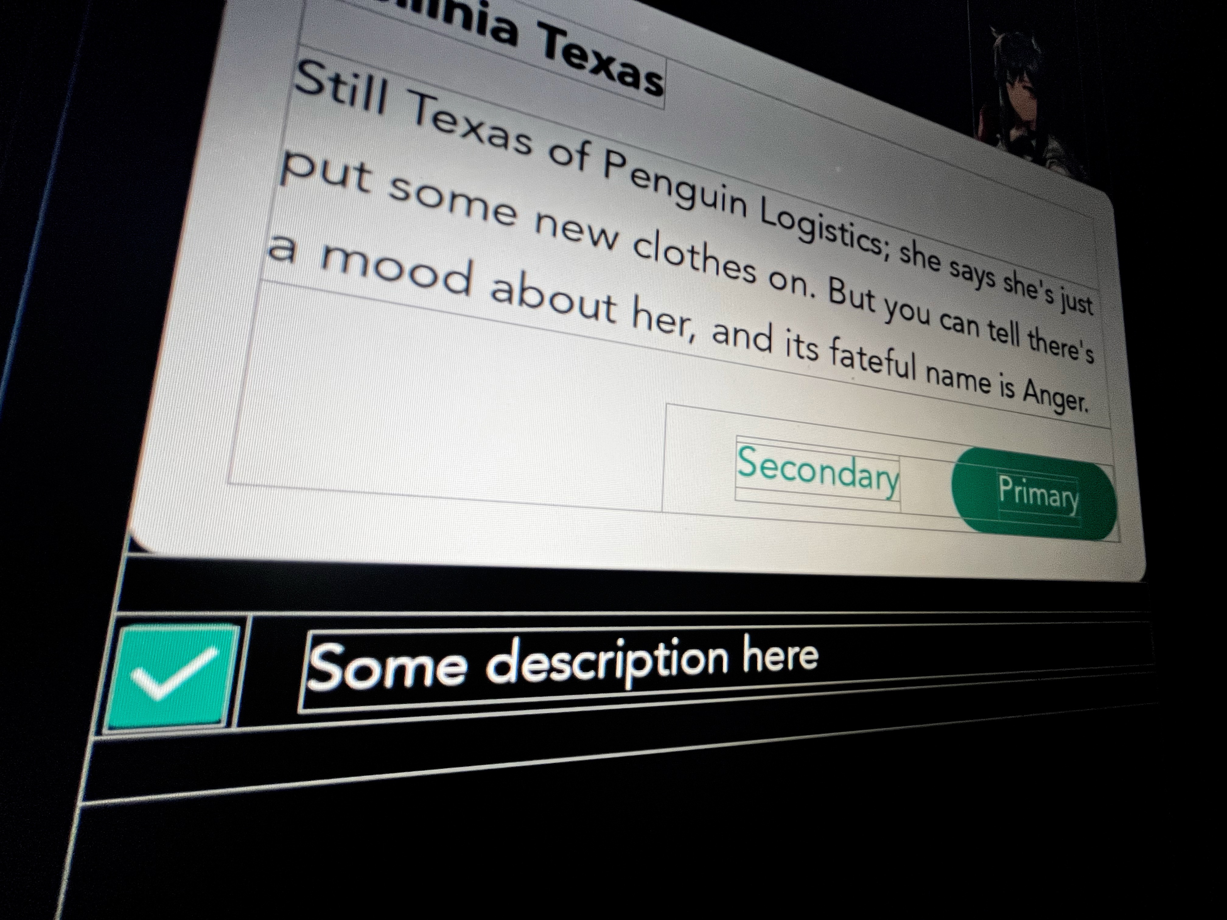
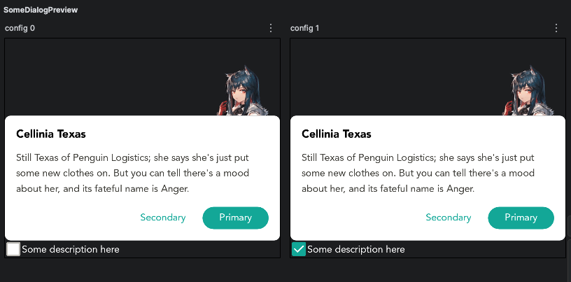
You put it inside @Preview and, unexpectedly, the layout doesn’t match what you expected. For some reason, the checkbox is too far to the right and shifted down. You try to check if you accidentally added a Modifier.padding or Modifier.size that might be affecting the position or size of the checkbox, but you don’t find anything.
You look at the preview again and realize that the checkbox doesn’t have the white background like in the design. You try looking for a parameter to change the background color in CheckboxColors, but again, you find nothing.
You end up spending your weekend trying to figure out why using a checkbox isn’t as straightforward as it seemed. Pretty frustrating, especially since the design you need to implement is so simple.
If you run the "Interactive Mode" in the preview, you’ll notice that the size is actually based on the ripple effect size each time you press the checkbox. Okay, maybe we can change the Indication on the checkbox by using another Indication (in Virgo project, we have NoOpIndication for interaction without showing the ripple effect). Still doesn’t work.
Since your QA team is expecting to do testing next Monday, and it’s Sunday and you’re tired of dealing with this over the weekend, you end up doing something silly to fix the issue temporarily by shifting the row with Modifier.offset to position the checkbox as per the design and wrapping the checkbox with a box + Modifier.background to add the background. It works, kind of.
It’s so frustrating, yes. It shouldn’t be that the hacky approach is the only way to get the design right. But at first glance, you don’t find any documentation on this behavior (at least not without diving into the source code of Compose Material or looking at the Material Design documentation). So what happened, and what should be the correct way to fix the issue? Time to dig into the implementation of Checkbox in Compose Material 3.
Diving into the Checkbox
Let’s try to solve something that seems simple, like changing the background color of a checkbox.
The Checkbox has a parameter colors: CheckboxColors with the default value CheckboxDefaults.colors(). The CheckboxColor constructor has the checkedBoxColor and uncheckedBoxColor parameters, which are exactly what you were looking for.
The first thing you try is to check if you can simply change the background color by providing checkedBoxColor and uncheckedBoxColor through CheckboxDefaults.colors(). Unfortunately, CheckboxDefaults.colors() only has parameters to change the color of the checkbox itself, not the background color.
The way you could do this is either by creating your own instance of CheckboxColors (which isn’t worth the time since you only need to change the background color, but you'd have to provide colors for both states as well), copying MaterialTheme.colorScheme.defaultCheckboxColors (which is essentially the same, just that you're “copying” MaterialTheme.colorScheme.defaultCheckboxColors instead of creating your own instance of CheckboxColors), or copying the CheckboxColors provided by CheckboxDefaults.colors and passing the background color value. The third option is the one with the least effort because you don’t need to provide all the other colors (though it’s a bit tricky).
Checkbox(
    checked = permanentlyHide,
    onCheckedChange = { permanentlyHide = !permanentlyHide },
    enabled = true,
    colors = CheckboxDefaults.colors(
        checkedColor = YourColor.Primary,
        uncheckedColor = YourColor.NotPrimary,
        checkmarkColor =  YourColor.Content,
    ).copy(
        uncheckedBoxColor = Color.White
    ),
)
When you check the preview again, you’ll see that now your checkbox has the background color matching the design. Cool!
But honestly, I don't understand why something as simple as changing the background color of a checkbox has to be so complicated. Why does CheckboxDefaults.colors only let you configure the checkmark color and the color when the checkbox is checked? Doesn’t Material Design recommend providing a custom color for the unchecked state as well? Checkboxes are such a common component and are used in many contexts, including overlays and screens with transparent/translucent background. Having a transparent background by default makes sense in some cases, but why make it so difficult (or not as simple as changing the checkmark and checked background color) to modify it?
Okay now, what about the positioning of the checkbox? Unfortunately, this isn’t straightforward either.
When you look at the source code of Checkbox, you’ll realize that internally, Checkbox applies Modifier.minimumInteractiveComponentSize. In short, Modifier.minimumInteractiveComponentSize forces the component that applies this modifier to have a minimum size of 48dp. Why? Simply put, it’s to provide enough space for touch interaction with the component. And because this modifier is applied deep within the implementation of Checkbox (specifically in CheckboxImpl inside TriStateCheckbox), if you apply Modifier.size on the Checkbox, it will essentially be pointless because it will be overridden by Modifier.minimumInteractiveComponentSize anyway. So, is using the offset solution the right one? Well, not really.
(note: If you want to read more about this guideline by Material, go check https://m3.material.io/foundations/layout/understanding-layout/density)
If you dig into the modifier node MinimumInteractiveModifierNode, you’ll see the variable LocalMinimumInteractiveComponentSize. This variable is a composition local provider that provides a default value of 48dp. This is the value used by the node to determine whether the component’s size is greater than the value provided.
...

val size = currentValueOf(LocalMinimumInteractiveComponentSize).coerceAtLeast(0.dp)

...

val sizePx = if (size.isSpecified) size.roundToPx() else 0
val width =
    if (enforcement) {
        maxOf(placeable.width, sizePx)
    } else {
        placeable.width
    }
val height =
    if (enforcement) {
        maxOf(placeable.height, sizePx)
    } else {
        placeable.height
    }

...
If you look closely, before comparing the size with the placeable’s size, it first checks whether LocalMinimumInteractiveComponentSize is specified. If not, the size of the placeable will be compared to 0px. In other words, to "bypass" the minimum size restriction of 48dp on the Checkbox, you need to provide the value Dp.Unspecified for LocalMinimumInteractiveComponentSize. We can just wrap our dialog (or just the checkbox, even) with CompositionLocalProvider and provide the value!
CompositionLocalProvider(
    LocalMinimumInteractiveComponentSize provides Dp.Unspecified,
) {
	// Dialog Composable function or just the checkbox like this.
     Checkbox(
        checked = checked,
        onCheckedChange = { },
        enabled = true,
        colors = CheckboxDefaults.colors(
            checkedColor = CloverTheme.color.primary50,
            uncheckedColor = CloverTheme.color.mist40,
            checkmarkColor = CloverTheme.color.mist10,
        ).copy(
            uncheckedBoxColor = Color.White
        )
    )
}
Applying some fix, and voila! Now it looks like the design.

If you check the preview again, you’ll see that the position of the checkbox now matches the design as expected. Okay, it’s been quite a journey just to adjust the position of the checkbox to fit the design. But at least all the issues are finally resolved (even though, for something this simple, the effort was a bit much not gonna lie yeah).
When working with UI libraries like this, you generally expect your code to just work. For instance, if you have a UI component and you set its size using Modifier.size or other appropriate modifiers, the user expects the component to apply the size automatically, without additional effort (or even the need to read the code). If there are restrictions on the component, such as a default or minimum size, it should at least be documented—ideally, something you can find by simply hovering over the component function. When you, as a user, set a size via a modifier but the component doesn’t apply it, it leaves the user—the UI library consumer—confused. Having to manually search through the code to find the source of the size restriction, or even dig through Material's documentation on minimum interactive component size, just adds unnecessary cognitive load and wastes time on a simple task. And funny enough, this issue isn't limited to checkbox. Other components also suffer from the same problem (just take a look at Material's switch, for example).
Material 3 is not just a UI library
So now, what’s the "problem"? The problem is that I was too focused on treating Material 3 as just a "UI library" built on top of Compose UI. But in reality, Material 3 isn’t just a "UI library" — it’s a design library. Material 3 is a design library that contains components designed to comply with Google’s (Material) opinionated design choices and is meant to "just work" if you’re using Material 3 as your app's design language. But if you have your own design language — which is very common if you have brand-specific designs and colors — and you build on top of Material 3, then you’re bound to encounter behaviors designed specifically for Material 3. Some of these behaviors might not be immediately obvious or easy to understand, like the case of the minimum touch interaction size enforced by Material 3. You’ll be faced with a dependency that is always evolving, both design-wise and behavior-wise, which could change in the future and break your app (which happened many times, at least when I used Compose Material in the Virgo project). And, boy, it’s soooo frustrating. Your app suddenly crashes, or your background components change, sizes don’t meet your expectations, or the component you’re using changes (yes, I’m looking at you, pull-to-refresh). You name it. So, can you just accept it? Of course not (well, it depends).
Build your own design library
If your design is based on Material Design, or if you don’t have much time to implement your own design, then using Compose Material is definitely the right choice because it just "works" out of the box. But what if you have a design that’s quite complex or maybe not based on Material Design at all? You can build your own design library.
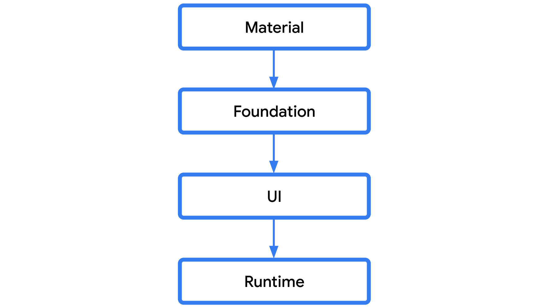
If you look the Compose layer, Compose Material is a library built on top of Compose Foundation. Compose Foundation provides basic building blocks for you to create your own design library, and using Compose Material is basically optional. Of course, it won’t be as expansive as Compose Material. You won’t find components like checkboxes, switches, pull-to-refresh, and so on. But basic building blocks like Box, Row, Column, or interactive components like BasicTextField and BasicText (yes, if you’ve been using Text, then you’re actually using Material Design components) are available for you to extend according to your brand’s design and behavior. This is something I’ve done in every personal project of mine. By building your own design library and extending Compose Foundation, you have full control over your app’s design and aren’t reliant on third-party design systems. And it’s not that hard to implement. Well, if you run into issues or are unsure how to implement something, you can always look into the Compose Material source code to see how they solve those problems.
For example, what if you want to have a text field input with your brand’s background color, and that component needs to have rounded corners and have a specific minimum size? And you’re asked to animate the placeholder when the user enters a value. These kinds of things might be difficult to achieve using Material Design components. But you can extend BasicTextField to suit your needs. Take a look at my implementation, for example:
@Composable
fun StorytellerTextField(...) {
    BasicTextField(
        value = value,
        modifier = modifier.defaultMinSize(minWidth = 280.dp, minHeight = 52.dp),
        ...
        decorationBox = @Composable { innerTextField ->
            val background: @Composable () -> Unit = {
                Box(
                    modifier =
                    Modifier
                        .background(
                            color = LocalStorytellerColors.current.surfaceVariant.copy(alpha = 0.45f),
                            shape = RoundedCornerShape(8.dp),
                        ),
                )
            }

            val transformedText =
                remember(value, visualTransformation) {
                    visualTransformation.filter(AnnotatedString(value))
                }.text.text
            val transition =
                updateTransition(transformedText.isEmpty(), label = "TextFieldInputState")
            val placeholderOpacity by transition.animateFloat(
                label = "PlaceholderOpacity",
                transitionSpec = {
                    tween(
                        durationMillis = 60,
                        delayMillis = 60,
                        easing = LinearEasing,
                    )
                },
            ) {
                if (it) 1f else 0f
            }

            val placeholderText: @Composable ((Modifier) -> Unit)? =
                if (placeholder != null && transformedText.isEmpty() && placeholderOpacity > 0f) {
                    @Composable { modifier ->
                        Box(modifier = modifier.alpha(placeholderOpacity)) {
                            StorytellerText(
                                text = placeholder,
                                textStyle = textStyle,
                                color = textColor.copy(alpha = 0.5f),
                            )
                        }
                    }
                } else {
                    null
                }

            StorytellerTextFieldDecorationBox(...)
        },
    )
}

...
I thought I had an example for a switch/checkbox in my personal design library, but apparently, I haven't implemented it yet. So, I can't compare how to solve the original issues using my own component.
Closing or conclusion, idk
From this simple checkbox, I realized that Compose Material is an incredibly easy-to-use library that covers almost all the common design components for most apps. However, it’s not uncommon that you’ll need to implement designs or behaviors that don’t quite align with Material Design principles. This often forces you to dive into the source code, searching for ways to change the default Material Design behaviors to meet your design needs. If your design is based on Material, then using Material is definitely the right choice. But if it’s not, and you have the time to build your own design library, I highly recommend it. It’ll save you a ton of time and effort from troubleshooting why your app’s design implementation suddenly doesn’t match or why your app’s behavior randomly changes in the future without you noticing.
Also fun fact, the design later was scrapped and the get slightly changed (the checkbox now inside the card, which now it doesn't need to explicitly set the background color, awesome!).